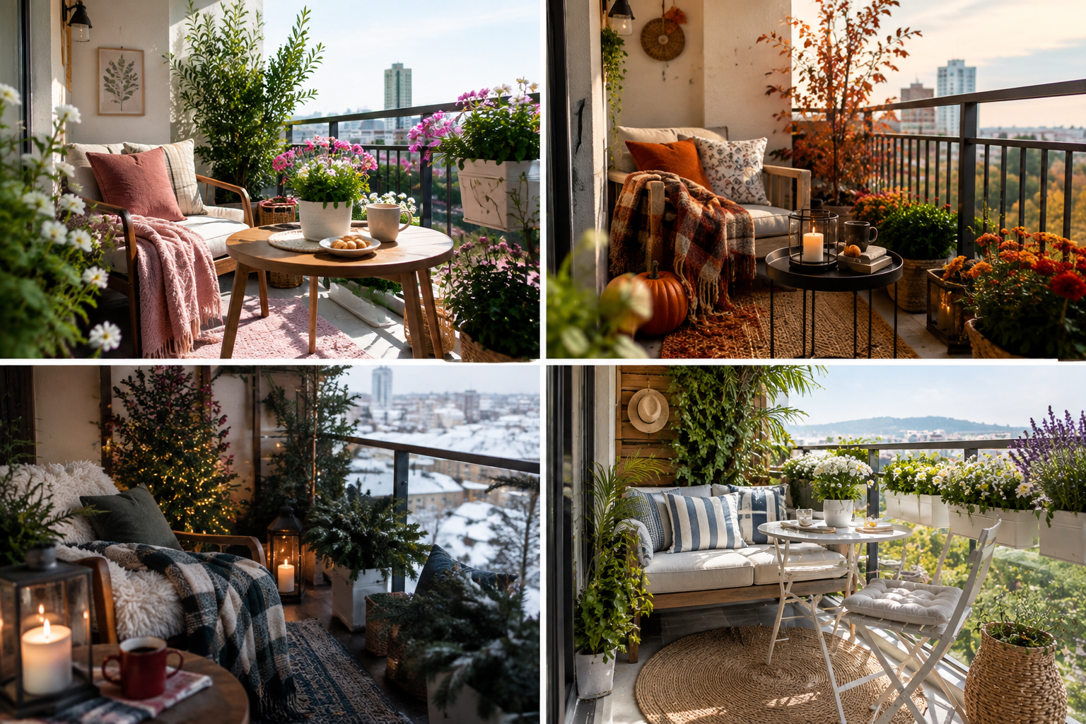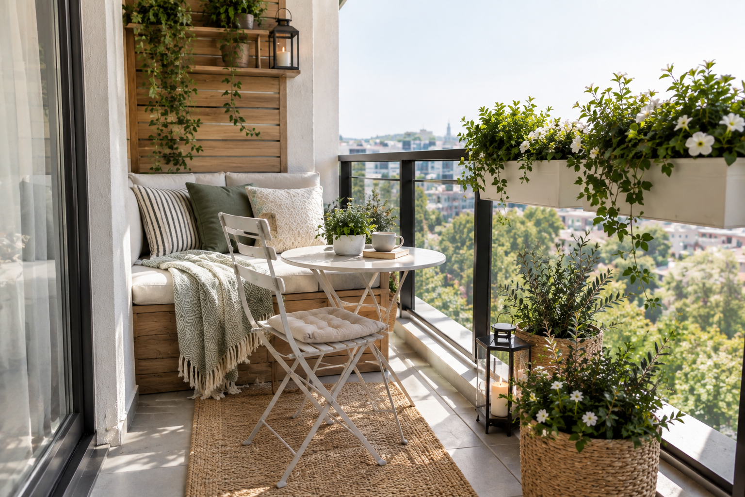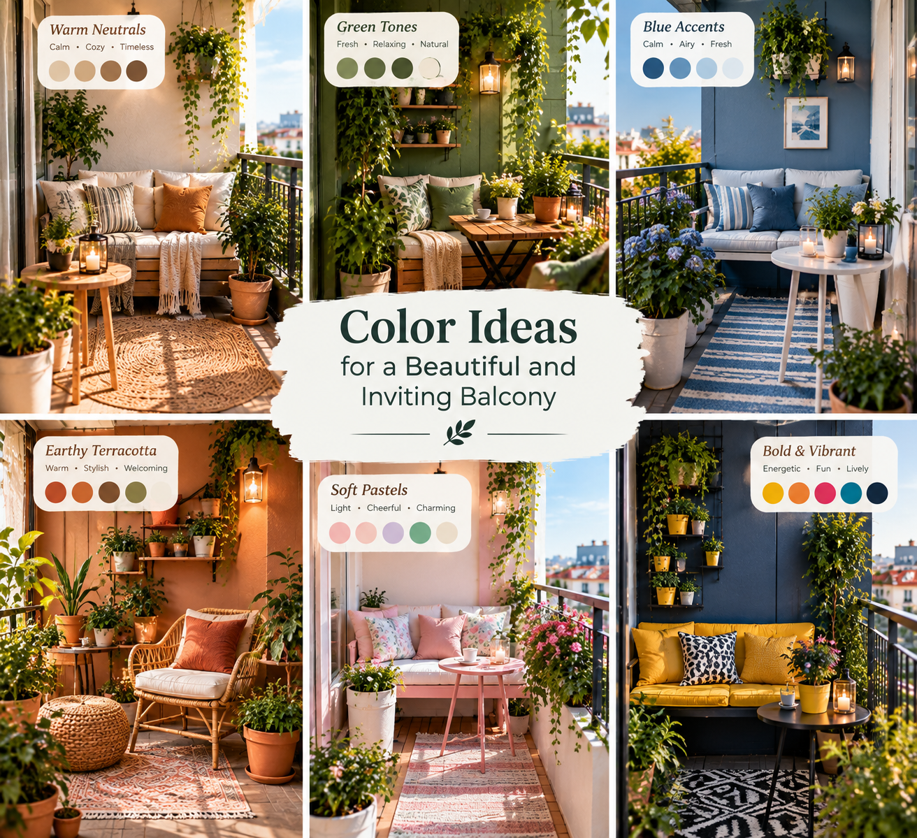
Transforming an exterior ledge, concrete loggia, or compact terrace into an extension of your interior living space requires a deliberate strategy that accounts for harsh sunlight, shifting shadows, and architectural constraints. When exploring color ideas for a beautiful and inviting balcony, the goal is not merely decorating a surface, but manipulating spatial perception, thermal absorption, and psychological comfort. Urban balconies frequently suffer from visual fatigue caused by exposed concrete, glaring metal railings, and harsh southern or eastern exposures that wash out weak hues or overheat dark surfaces. To establish a truly cohesive sanctuary, you must evaluate how natural light behaves across your specific coordinates. Morning light carries a crisp, cool blue spectrum that softens muted greens and pale stones, whereas afternoon sun blasts spaces with intense yellow tones, turning stark whites into blinding reflections and making saturated warm tones feel oppressive. By carefully calibrating your color schemes against structural elements like brick facades, aluminum frames, and overhead slabs, you establish a harmonious visual flow. Incorporating tactile materials such as weathered teak, woven synthetic rattan, powder-coated steel, and terracotta tiles adds depth, preventing a single-color palette from feeling flat. The secret lies in balancing high-reflectance background planes with grounding floor anchors and vibrant, highly saturated focal points. Whether you are addressing an intimate two-person Juliet balcony or a wraparound penthouse terrace, thoughtful color theory bridges the gap between raw exterior architecture and sophisticated indoor design standards, ensuring your outdoor room remains inviting across all four seasons.
Spatial Psychology and Proportion: How Color Alters Small Balconies
Spatial constraints present distinct design challenges that can be successfully resolved through intelligent paint applications and material selection. In tight architectural footprints, the wrong hue choices compress sightlines and make the area feel claustrophobic. Conversely, applying a master-class understanding of chromatic physics allows you to push boundaries outward and elevate low ceilings.
Expanding Compact Footprints with Light Neutrals
Expanding the visual boundaries of a narrow balcony starts with the perimeter walls. Selecting light, high-reflectance shades such as warm chalk, soft alabaster, or pale greige bounces natural sunlight deeper into the core of the living area, dissolving harsh corners. Avoid stark industrial blue-whites, which read as cold and sterile under overcast skies. Instead, lean toward organic neutrals with subtle yellow or brown undertones that echo natural stone and sand. When vertical surfaces recede visually, the floor space automatically feels wider and more accommodating to foot traffic.
Grounding the Space with Dark Floor Finishes
Balancing high-reflectance walls requires anchoring the lower plane. If your walls and ceilings are drenched in pale tones, treat the flooring as a visual anchor. Using deep charcoal composite decking, dark stained hardwood tiles, or matte slate gray stone pavers pulls the eye downward, creating a stable foundation. This deliberate contrast prevents the balcony from feeling like a floating, unstable platform. A grounded floor plane makes furniture arrangements feel more secure and intentional, anchoring oversized planters and lounge seating without cluttering the horizontal field of view.
Palette Archetypes and Technical Color Combinations
Developing a sophisticated outdoor color scheme relies on curating complementary undertones rather than relying on random bright accents. Professional landscape and interior designers utilize distinct palette archetypes tailored to specific architectural styles and microclimates.
- The Mediterranean Terrazzo Palette: Combines sun-bleached terracotta walls, olive green foliage, mustard yellow textiles, and weathered brass accents to capture warmth and diffused southern light.
- The Modern Coastal Scheme: Pairs crisp salt-washed whites with deep navy blue railings, sandy beige flooring, and driftwood gray accents to maximize maritime brightness without causing glare.
- The Urban Biophilic Retreat: Utilizes deep forest green perimeter panels, charcoal metal railings, natural cedar wood tones, and stone gray planters to merge outdoor living with wild vegetation.
- The Monochromatic Minimalist: Employs tonal variations of gray, from pale zinc to rich graphite, accented by matte black fixtures and stark geometric ceramics for a sleek urban profile.
When selecting exterior paints, stains, or powder-coat finishes, always test large physical swatches on-site over a forty-eight-hour period. Exterior daylight shifts dramatically from direct overhead glare to twilight shadow, and pigments that appear balanced indoors will often turn aggressively neon or chalky under unobstructed UV exposure.
Material Science, Durability, and Chromatic Longevity
Color selection on an open-air balcony cannot be separated from the physical performance of materials under thermal cycling, moisture, and ultraviolet degradation. Dark surfaces absorb significantly more solar radiation, leading to excessive heat buildup that can crack fragile ceramics, warp composite decking, or make metal handrails too hot to touch during peak summer afternoons. Conversely, low-pigment light finishes on horizontal surfaces show dirt, urban soot, and pollen deposits much faster, requiring rigorous maintenance schedules.
| Material Category | Recommended Color Range | Thermal Behavior | Maintenance Profile |
|---|---|---|---|
| Powder-Coated Aluminum | Matte Charcoal, Bronze, Soft Sage | Moderate heat retention; resists fading | Low; wipe clean with mild surfactant |
| Terracotta & Clay Planters | Natural Red, White Slurry Wash | Breathable; moderates root temperatures | Medium; susceptible to efflorescence |
| Hardwood Decking (Teak, Ipe) | Deep Honey, Golden Ochre, Silver Patina | Absorbs moderate warmth; stays comfortable | High; requires annual oiling or sealing |
| Performance Textiles (Acrylic) | Terracotta, Indigo, Olive, Sand | High UV resistance; minimal heat trapping | Low; machine washable and quick drying |
- Assess your balcony orientation to determine the exact hours of direct sunlight and thermal loading.
- Choose structural paint and finishes with high LRV, known as Light Reflectance Value, for vertical surfaces in shaded microclimates.
- Select deep color pigments primarily for vertical focal points, privacy screens, and movable accessories rather than large horizontal decks.
- Integrate weather-resistant outdoor fabrics treated with UV inhibitors to prevent premature fading of accent pillows and upholstery.
Multi-Layered Illumination and Nighttime Color Rendition
Color does not exist without light. Once the sun dips below the horizon, your carefully curated color palette risks disappearing into muddy shadows unless supported by a multi-layered lighting strategy. Relying on a single harsh overhead bulkhead fixture flattens textures and creates unflattering glare. Instead, deploy three distinct tiers of illumination to preserve color depth and warmth during evening hours.
Ambient illumination should stem from warm LED string lights, indirect wall sconces with a Kelvin rating between 2400K and 2700K, or portable rechargeable lanterns. This warm spectrum enriches earthy tones like terracotta, ochre, and brick red, while keeping deep greens and indigos from reading as black. Task lighting must be integrated near cooking surfaces, reading chairs, or small bistro tables using directional, low-glare fixtures. Finally, accent illumination transforms the entire spatial dynamic by positioning upward-pointing spotlights at the base of architectural planters or trailing vines. This technique casts dramatic shadows against perimeter walls, accentuating vertical textures and giving flat exterior surfaces a rich, layered sculptural quality after dark.
Structuring Circulation Paths and Visual Anchors
Even the most meticulously styled color palette will fail if the physical layout restricts movement or creates visual clutter. A successful balcony design treats every square inch as a precious commodity, balancing negative space with functional focal points. Establish a clear circulation path from the interior threshold to the outer railing, ensuring your feet encounter unobstructed flooring. Do not block natural sightlines from inside your home out to the exterior view; keeping low furniture profiles near windows preserves the connection to the landscape beyond.
Create a single powerful visual anchor rather than scattering numerous small, competing color statements across the deck. A large, oversized ceramic urn finished in a vibrant Mediterranean blue or a rich burnt orange draws the eye outward, creating an intentional point of interest that tricks the brain into perceiving the balcony as deeper and more expansive. Layer secondary accessories, such as weather-resistant outdoor rugs and textured cushions, in complementary neutral tones to support this primary anchor without overwhelming the limited perimeter. By maintaining disciplined negative space around your furniture groupings, you allow the color choices to breathe, resulting in a tranquil, highly sophisticated outdoor retreat.
Frequently Asked Questions About Color Ideas for a Beautiful and Inviting Balcony
What are the best colors to make a small balcony look bigger?
Pale neutrals such as warm off-white, soft greige, and light stone gray work exceptionally well on vertical walls and railings to expand a small balcony. These light-reflective shades bounce sunlight across the space, dissolving hard corners and pushing boundaries outward. Pair these bright vertical surfaces with a slightly darker floor finish, like charcoal gray or deep wood tones, to ground the footprint without sacrificing spatial width.
How do I choose exterior colors that match my indoor decor?
Look at the flooring material and color palette immediately inside your balcony door. To achieve seamless visual continuity, select an exterior color scheme that pulls secondary or tertiary accent tones from your interior living room rugs, upholstery, or artwork. If your interior features warm wood and earthy neutrals, mirror those elements outdoors while selecting UV-resistant formulations rated specifically for exterior performance.
Do dark colors make a balcony feel too hot in the summer?
Dark colors absorb significantly more solar radiation than light shades, which can cause metal railings, dark composite decking, and exterior walls to retain heat and become uncomfortably warm during peak summer months. To prevent thermal overload while still enjoying deep, moody hues, limit dark colors to vertical privacy screens, planters, or accent accessories, and keep large horizontal surfaces in lighter, heat-reflective tones.
How can I protect my balcony color scheme from fading in the sun?
Ultraviolet radiation breaks down pigment bonds over time, causing exterior paints, fabrics, and stains to wash out or turn chalky. Combat this degradation by investing in premium 100 percent acrylic exterior paints with high-grade mineral pigments, and specify solution-dyed acrylic fabrics for all outdoor cushions, pillows, and umbrellas. Additionally, applying a protective UV-blocking clear topcoat to wood surfaces and masonry will lock in your chosen hues for multiple seasons.